Posts

music video

     For our music video it took us a while to decide on a song and how we wanted to shoot our video. We decided on the song congratulations by Post Malone. We had to try to recreate the music video and in the original theres alot of illegal items so we had to adjust the theme. We decided to make it more of a birthday party.      We had alot of schedule issuse on some of is being absent or out of town. Our video takes place in a studio so we used the studio we had here at school and filmed during class so we didn’t have to plan around our crazy schedules. Our story boards and beat sheet got done pretty quickly. They weren’t to hard but helped alot while filming.      We got most our film in one class and throughout editing if we didn't have enough it was easy to go to the studio and film really fast. editing was also really simple and I enjoyed doing it a lot more than I thought I would. I learned a lot about sequencing while filming and ...

typography

Image
     For this project I knew what quotes I wanted to use with out thinking about it too much. the quotes I used are ones I tell myself everyday and ones I live by. To start I went on da font.com and I downloaded at least 15 fonts just to have handy and so I could try a whole bunch of different styles without having to guess what the word will look like with the font.       After I put my quotes in styles and fonts I liked I added some pictures to go along with them. during this process I got done rather fast so I decided to add other quotes just so I had more to choose from. I had at least 8 black and white put together quotes and after playing around with them I choose my best 4.      As I started to add color I changed a lot about some of my quotes. Theres some I changed completely and like a lot more then the original version. I also added some more effects to the quotes as I added color. As I added more color I also added more graphic...

final review on my work this semester

Image
     This semester I don't think I did my very best work. Im not the best at graphic design and I font see myself using it in the future. I have learned few things on Adobe Illustrator but I don't feel the need to know how to use it for anything but this class. I still will continue to finish my projects and turn them in but I honestly don't find much joy or reason to do it in my future. I hope next semester I can do better and give more time into my projects then I did this semester. transfer print      The few projects I completes this semester that I enjoyed finishing was the transfer print and the nature man. The printing process was nice because it was off the computer and ended up looking better then I imagined. The nature man was hard at first but after I got the hang of it I enjoyed it. it got stressful at the end because I didn't get a good copy of the instructions and I had to go back and fix most the project. I still really enjoyed how it tu...

my transfer print

Image
     In class we made a transfer print of our own, we used a project we made this year. We created a watercolor piece and used that as our background to transfer our piece onto. We printed out our project we wanted on our transfer I choose a part of my panorama project I made on photoshop.     To start making our transfer we used mod podge to apply the printed project onto the water color paper face  down. After placing the paper on the water color I used a squeegee to roll out any bubbles and even out the mod podge. The mod podge transfers the ink from the paper onto the water color paper when the mod podge dries. Because the mod podge dries clear its okay to get some around the paper onto the watercolor.      When the mod podge dries you have to use your fingers and rub water on the back. This will lift up the paper and leave the ink. You have to rub until all the aper rolls off and the ink left is smooth when you rub it. If its not sm...

panorama

Image
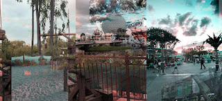
     On a sandy resort with the wind blowing through our hair as you walk throgh and see all the tress and wild life and your filled with joy strolling to the bus stop. Sitting on the cod bus as you slowly drive through the streets with resorts and attractions on all sides. You arrive at the gates of The Magic Kingdom right before sunset. Walking to Tomorrowland and crossing every type of person that you'll ever see. From strollers to mickey ears and the ocasional Oswald ears and the vendors with ice cream.  The smell of cinnamon and happiness blows through the air at the happiest place on earth.        You get to watch the sunset with beautiful oranges and pinks over the horizon of Tomorrowland, its a sight you'll never forget. After taking a wild ride in the wilderness on thunder mountain its decided its time for a break from all the magic and you get back on the bus and ride to The Animal Kingdom for a ride through Mt. Everest. At the top of...

printing process

Image
   In class we watched videos on different printing process. We watched videos over the R elief process, the intaglio process, and the lithography process. There are different steps supplies and looks to each process. They are all very different and used in many different ways.        INTAGLIO PROCESS-      There are different types of this process called dry point and etching. In this process the ink sits in the area of the surface that you cut out. To start the process you have to start by polishing and cleaning the surface so nothing will come in contact with your project. After cleaning add ground to the surface then smoke plate until black.  Then you scratch away the ground on the plate to reveal the metal underneath it. These scratches will be the dark part of your image, since the ink sits inside the scratches made earlier. Next you start etching which eats away at all the bare metal areas on the plate. It is then removed and...

pop art

Image
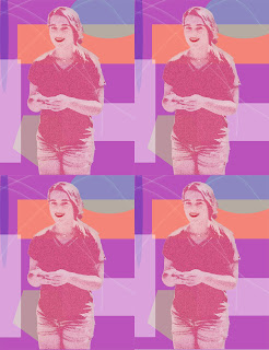
    For this project I didn't really have a style or artist I was trying to copy. For the most part I was playing around with different tools and asking neighbors what they were doing or how I could make mine better and used some of those ideas. I used different shapes and colors in the background to give contrast. I added a filter to my subject as well as color and adding other aspects. After I was happy with my image my teacher gave me the idea of duplicating my image like done in lots of pop art. As well as duplicating the image I also decided to make my subject bigger and fill up more of the frame.      For the colors I really enjoy light colors such as light pink, blue, and purple so I decided to use those in my picture. Other then that I didn't have a set theme in my project. With making the shapes I used different shape tools that photoshop prov...