Creating a Poster
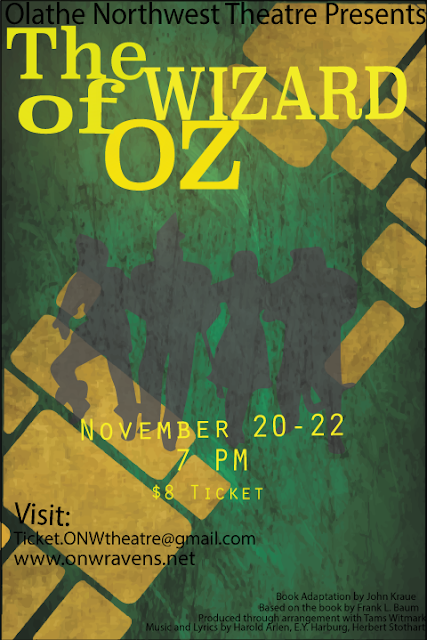
CONTRAST I used contrast by choosing different colors that stood out but also looked well together. I also used different typefaces and transparencys in the art. ALIGENMENT In the alignment I kept my least important information aligned to the sides they were on and most of everything else is center aligned. REPETITION Repeating colors was most of my repetition the least important information is all one color while the more important is in a brighter color . PROMXITY In the poster I grouped together the least information to the bottom of the poster in small font while the title of the play and time are bigger and in the center