Posts

final

Image
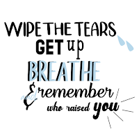
Over the year we had a lot of great projects, one of my favorites was the typography project. In this project we used quotes that relate to us and used different colors and fonts to display our quotes. I enjoyed this project because it was super fun to make and at the end I was very proud of how they looked. This project took a few weeks to complete and I faces many challenges. One was finding what fonts and layouts looked good with the quotes. There was trial and error and deleting and restarting. Going into the project I had no idea what any what I wanted to look like. Playing around with the quotes gave me more of an idea of how I wanted them to look. Playing around with format, font, and colors was very fun and relaxing to me. I tried a lot of different styles and designs till i was happy with what I made.  After I made the 4 that was required and I liked how they look I had a few extra days. I wanted to make some extra quotes just so I had more to choose from and see if I could

movie trailer

     In the movie trailer project I was gone for most of the time. Not being there really took a toll on me being informed of that was happening. My group decided to to the movie Stand and Deliver. I was gone for most the storyboarding and pre production. I got to help and shoot some scenes and get actors in place. for editing I looked for the clips and couldn't find them after I asked my group. so I decided to use the clips I found on the server and edited that video.       I edited the video in an hour so it wasn't late. the editing was really bad and something I hated that I had to turn in. I'm disappointed of how it looked but I didn't have time to come in and fix everything because of all the other work I had to juggle. Being gone really made this hard and a stressful experience but I learned a lot about how I need to communicate more with the people I'm working with .

vector project

Image
      For this project we had two options for our project. The first one was an organic reproduction of a portrait or a triangle reproduction. At first I choose to do the organic option and as I was completing it I decided I didn't like how it turning out. so I decided to change to the triangle project. Restarting a whole project a few weeks before its due and also being absent for at least a week made it very stressful.      We had to use a picture of a family member or family pet so I decided to use my sister. because I thought it would be something nice for her and she always likes to see what I make in ecomm. she is excited to join the program her freshman year.     I started the first project with a lot of hope that I could make it look good. When it started not turning out how I pictued it and I tried to add and change it to make it how I wold enjoy it and be proud to turn it in but it still wasn't something I would have been proud to turn in. I decided about two week

music video

     For our music video it took us a while to decide on a song and how we wanted to shoot our video. We decided on the song congratulations by Post Malone. We had to try to recreate the music video and in the original theres alot of illegal items so we had to adjust the theme. We decided to make it more of a birthday party.      We had alot of schedule issuse on some of is being absent or out of town. Our video takes place in a studio so we used the studio we had here at school and filmed during class so we didn’t have to plan around our crazy schedules. Our story boards and beat sheet got done pretty quickly. They weren’t to hard but helped alot while filming.      We got most our film in one class and throughout editing if we didn't have enough it was easy to go to the studio and film really fast. editing was also really simple and I enjoyed doing it a lot more than I thought I would. I learned a lot about sequencing while filming and I really enjoyed getting to know that sk

typography

Image
     For this project I knew what quotes I wanted to use with out thinking about it too much. the quotes I used are ones I tell myself everyday and ones I live by. To start I went on da font.com and I downloaded at least 15 fonts just to have handy and so I could try a whole bunch of different styles without having to guess what the word will look like with the font.       After I put my quotes in styles and fonts I liked I added some pictures to go along with them. during this process I got done rather fast so I decided to add other quotes just so I had more to choose from. I had at least 8 black and white put together quotes and after playing around with them I choose my best 4.      As I started to add color I changed a lot about some of my quotes. Theres some I changed completely and like a lot more then the original version. I also added some more effects to the quotes as I added color. As I added more color I also added more graphics and designs as well as moved some things a

final review on my work this semester

Image
     This semester I don't think I did my very best work. Im not the best at graphic design and I font see myself using it in the future. I have learned few things on Adobe Illustrator but I don't feel the need to know how to use it for anything but this class. I still will continue to finish my projects and turn them in but I honestly don't find much joy or reason to do it in my future. I hope next semester I can do better and give more time into my projects then I did this semester. transfer print      The few projects I completes this semester that I enjoyed finishing was the transfer print and the nature man. The printing process was nice because it was off the computer and ended up looking better then I imagined. The nature man was hard at first but after I got the hang of it I enjoyed it. it got stressful at the end because I didn't get a good copy of the instructions and I had to go back and fix most the project. I still really enjoyed how it turned out and

my transfer print

Image
     In class we made a transfer print of our own, we used a project we made this year. We created a watercolor piece and used that as our background to transfer our piece onto. We printed out our project we wanted on our transfer I choose a part of my panorama project I made on photoshop.     To start making our transfer we used mod podge to apply the printed project onto the water color paper face  down. After placing the paper on the water color I used a squeegee to roll out any bubbles and even out the mod podge. The mod podge transfers the ink from the paper onto the water color paper when the mod podge dries. Because the mod podge dries clear its okay to get some around the paper onto the watercolor.      When the mod podge dries you have to use your fingers and rub water on the back. This will lift up the paper and leave the ink. You have to rub until all the aper rolls off and the ink left is smooth when you rub it. If its not smooth add more water and rub harder until it