Posts

Showing posts from 2018

final review on my work this semester

Image
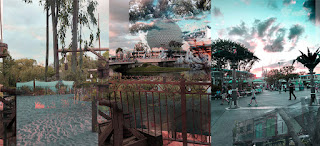
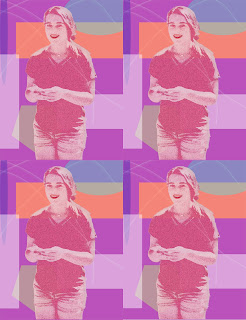
     This semester I don't think I did my very best work. Im not the best at graphic design and I font see myself using it in the future. I have learned few things on Adobe Illustrator but I don't feel the need to know how to use it for anything but this class. I still will continue to finish my projects and turn them in but I honestly don't find much joy or reason to do it in my future. I hope next semester I can do better and give more time into my projects then I did this semester. transfer print      The few projects I completes this semester that I enjoyed finishing was the transfer print and the nature man. The printing process was nice because it was off the computer and ended up looking better then I imagined. The nature man was hard at first but after I got the hang of it I enjoyed it. it got stressful at the end because I didn't get a good copy of the instructions and I had to go back and fix most the project. I still really enjoyed how it turned out and

my transfer print

Image
     In class we made a transfer print of our own, we used a project we made this year. We created a watercolor piece and used that as our background to transfer our piece onto. We printed out our project we wanted on our transfer I choose a part of my panorama project I made on photoshop.     To start making our transfer we used mod podge to apply the printed project onto the water color paper face  down. After placing the paper on the water color I used a squeegee to roll out any bubbles and even out the mod podge. The mod podge transfers the ink from the paper onto the water color paper when the mod podge dries. Because the mod podge dries clear its okay to get some around the paper onto the watercolor.      When the mod podge dries you have to use your fingers and rub water on the back. This will lift up the paper and leave the ink. You have to rub until all the aper rolls off and the ink left is smooth when you rub it. If its not smooth add more water and rub harder until it

panorama

Image
     On a sandy resort with the wind blowing through our hair as you walk throgh and see all the tress and wild life and your filled with joy strolling to the bus stop. Sitting on the cod bus as you slowly drive through the streets with resorts and attractions on all sides. You arrive at the gates of The Magic Kingdom right before sunset. Walking to Tomorrowland and crossing every type of person that you'll ever see. From strollers to mickey ears and the ocasional Oswald ears and the vendors with ice cream.  The smell of cinnamon and happiness blows through the air at the happiest place on earth.        You get to watch the sunset with beautiful oranges and pinks over the horizon of Tomorrowland, its a sight you'll never forget. After taking a wild ride in the wilderness on thunder mountain its decided its time for a break from all the magic and you get back on the bus and ride to The Animal Kingdom for a ride through Mt. Everest. At the top of the coster you can see all of

printing process

Image
   In class we watched videos on different printing process. We watched videos over the R elief process, the intaglio process, and the lithography process. There are different steps supplies and looks to each process. They are all very different and used in many different ways.        INTAGLIO PROCESS-      There are different types of this process called dry point and etching. In this process the ink sits in the area of the surface that you cut out. To start the process you have to start by polishing and cleaning the surface so nothing will come in contact with your project. After cleaning add ground to the surface then smoke plate until black.  Then you scratch away the ground on the plate to reveal the metal underneath it. These scratches will be the dark part of your image, since the ink sits inside the scratches made earlier. Next you start etching which eats away at all the bare metal areas on the plate. It is then removed and rinsed to finish etching. to start finishing you

pop art

Image
    For this project I didn't really have a style or artist I was trying to copy. For the most part I was playing around with different tools and asking neighbors what they were doing or how I could make mine better and used some of those ideas. I used different shapes and colors in the background to give contrast. I added a filter to my subject as well as color and adding other aspects. After I was happy with my image my teacher gave me the idea of duplicating my image like done in lots of pop art. As well as duplicating the image I also decided to make my subject bigger and fill up more of the frame.      For the colors I really enjoy light colors such as light pink, blue, and purple so I decided to use those in my picture. Other then that I didn't have a set theme in my project. With making the shapes I used different shape tools that photoshop provides and I added different colors at different opacities. I tried to overlap a few shapes to make the picture look a little mo

nature man

Image
     At the start I couldn't figure out how to cut parts from the nature man as easily as I thought it would be. But once I figured it out it was pretty simple. after I got his jacket done I wanted to add a background image. This is where I had a lot of problums. I couldn't find a clear picture to use at first. Once I found a clear image to use i was having problems putting the background picture in place while also keep the picture I used for the jacket from overlapping. I asked for help from some of my class mates and they couldn't figure it out either. I decided to put the background on then lay the picture I wanted for the jacket over the jacket and erased the outsides of it so it fit in the jacket.      I enjoyed this project it helped me figure out new ways to do things on photoshop and now I know theres more then one way to do something if I'm stuck. Next time I want to be able to do the project without asking for help and finding things out on my own.      

photo editing videos

Image
   We were taught how to do multiple things on photoshop with videos and pictures provided by our teacher. These videos showed us how to  Content Aware Fill, Patch Tool, Clone Stamp Tool, Healing Brush Tool, Spot Healing Brush, and the portrait collage.        With learning how to use photoshop its much easier with the videos. I can pause and go back and that helps a lot for me when I'm learning something new. However  I didn't like how I couldn't ask questions. I can ask my teachers questions but its not as helpful as if I was asking the person in the videos the question.        I did already know how to use some of the tools that were shown but I never knew exactly what to use them for. It was cool to be able to use them and now know how I can use them in the future. Some parts of the videos were easy to follow other parts I had a hard time keeping up with. This made it difficult in some spots to know how to do something and how to fix it if I mess up.      I got done

Final Project

Image
     My group made a product called Ulu Lae and Ulu Lae is a hair growing shampoo that actually works. It works on bald spots and if you just want your hair longer. Making this product and the website, commercial, animations took about 10 weeks to finish and present everything. In the making of this product I personally found out that I am not the best at making animations or websites. But I have learned how to make animation and better my website making skills. Also I know how effective random groups are and that its important to listen to everyones ideas. We were told that our website, commercial, and animations need to be consistent and not look like 3 things that are totally different from each other. With that feedback we decided to pic a less wide color scheme and narrow it down to about 3 colors. Our product and presentation turned out better then I would ever imagine my group and I did a really well job on it in my opinion.        We got a lot done in class and in some strand

Final Web project

Image
     After doing the first web project last quarter I kinda had an idea on what I was doing. I still needed some help getting through because this time was a little different.  I had a lot of questions and got confused very easily. but I'm really happy with how it turned out after I made all the changes.

My personality type

Image
      Taking the the test to find out my personality I thought there was no reason to take it and after I would just forget about it and not care. After finding out my personality type and reading about it I changed my mind, I read the description and thought it was 110% accurate. Then I started to look at celebs with the same personality type and it put me in the best mood. I found out I have the same personality type as Prince, Marilyn Monroe, Mozart, and Jacqueline Kennedy. Now that I know my personality type I'm so interested in it and can't wait to know more.       In another personality test we took I also discovered I was a golden retriever. Golden retrievers are loyal, caring, loving, and like to work alone and want strong deep relationships. I believe that this is all very true about me.

creating my logo

Image
      I thought making a logo for myself was going to be one of the hardest things I have ever done. I am the most uncreative person that has ever walked on earth. But I began sketching and I had no clue what so ever on what I wanted this logo to look like. I drew random shapes and designs that hoped would just somehow look good together. I got two ideas that worked out pretty well.              Putting the ides on to illustrator and deciding what to do with them was way easier then I thought it made it was easier to decide what one I enjoyed most. I scratched the other one and totally dismissed the idea. Starting to play around with the other one random ideas popped into my head and I tried them just to see how it would work.                                                                                        I found that I really like how the circle looks with the dotted lines on the inside so I wanted to try different variations of having the m in the circle. From t

Creating a Poster

Image
CONTRAST I used contrast by choosing different colors that stood out but also looked well together. I also used different typefaces and transparencys in the art. ALIGENMENT In the alignment I kept my least important information aligned to the sides they were on and most of everything else is center aligned.  REPETITION Repeating colors was most of my repetition the least important information is all one color while the more important is in a brighter color . PROMXITY In the poster I grouped together the least  information to the bottom of the poster in small font while the title of the play and time are bigger and in the center

Typefaces

Image
                  While doing this project I learned that theres more to typing then I thought. I didn't know there were different names for every part of the letter and that there was so many types of founts that you should use for different things. In this project we named the different parts of letters and what the parts mean.            Now I know that there are many different parts of type and letter and how to identify them. I also learned that theres a lot that goes into making designs with picking the font to make sure it matches the theme of the design. I enjoyed getting to know all that goes into typefaces and I'm excited to get to know more and how I can improve my skill with typing and typefaces.

My Color Wheel

Image
                 For this project we made a color wheel using adobe illustrator. We made the circles,triangles and squares using the shape tools. The put them in the correct spots and added the color. We did this project to learn about the color wheel and about different colors that correspond.      From making my color wheel I now know how to use adobe illustrator.  I also know more about the color wheel and how diffrent colors work together and how color patterns are made. I enjoyed using illustrator it was pretty simple and I'm excited to use it in the future. About graphic design I really enjoyed it and I'm extremely excited for the future.      I think I did pretty okay on my project I had a few mistakes and questions but for my first time I think I did pretty okay. The next time I use illustrator I think I need to work on how I organize everything and my time management. I also need to not ask as many questions and figure more things out on my own.         

Logo colos

Image
 This logo uses the analogous colors of 3 different shades of blue. The company probably used these colors to make there drink look refreshing. This logo uses the analogous colors of green,yellow green, and yellow. these colors were probably chosen because they don't only look good together but they catch your eyes.  The FedEx logo uses the complementary colors of blue and orange.  These colors were probably use to show that the company is loyal. This logo uses the complementary colors of red and green. The colors  look good together so it makes it look like there food is good too.  This logo uses the cool colors of blue and green. The reason for picking these colors may be to give a relaxing feel to the logo.' The sprite logo used the cool colors of blue and green. This is to make there drink seem refreshing. The PayPal logo uses the monochromatic color of shades of blue. Blue is a color to show loyalty and the company wants you to have l