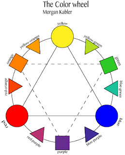
Posts

Showing posts from January, 2018

Typefaces

Image
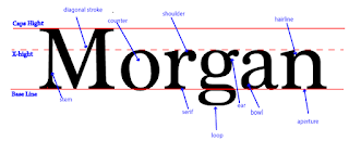
                  While doing this project I learned that theres more to typing then I thought. I didn't know there were different names for every part of the letter and that there was so many types of founts that you should use for different things. In this project we named the different parts of letters and what the parts mean.            Now I know that there are many different parts of type and letter and how to identify them. I also learned that theres a lot that goes into making designs with picking the font to make sure it matches the theme of the design. I enjoyed getting to know all that goes into typefaces and I'm excited to get to know more and how I can improve my skill with typing and typefaces.

My Color Wheel

Image
                 For this project we made a color wheel using adobe illustrator. We made the circles,triangles and squares using the shape tools. The put them in the correct spots and added the color. We did this project to learn about the color wheel and about different colors that correspond.      From making my color wheel I now know how to use adobe illustrator.  I also know more about the color wheel and how diffrent colors work together and how color patterns are made. I enjoyed using illustrator it was pretty simple and I'm excited to use it in the future. About graphic design I really enjoyed it and I'm extremely excited for the future.      I think I did pretty okay on my project I had a few mistakes and questions but for my first time I think I did pretty okay. The next time I use illustrator I think I need to work on how I organize everything and my time management. I also need to not ask as many questions and figure more things out on my own.         

Logo colos

Image
 This logo uses the analogous colors of 3 different shades of blue. The company probably used these colors to make there drink look refreshing. This logo uses the analogous colors of green,yellow green, and yellow. these colors were probably chosen because they don't only look good together but they catch your eyes.  The FedEx logo uses the complementary colors of blue and orange.  These colors were probably use to show that the company is loyal. This logo uses the complementary colors of red and green. The colors  look good together so it makes it look like there food is good too.  This logo uses the cool colors of blue and green. The reason for picking these colors may be to give a relaxing feel to the logo.' The sprite logo used the cool colors of blue and green. This is to make there drink seem refreshing. The PayPal logo uses the monochromatic color of shades of blue. Blue is a color to show loyalty and the company wants you to have l