Logo colos
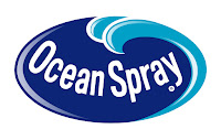
This logo uses the analogous colors of 3 different shades of blue. The company probably used these colors to make there drink look refreshing.
This logo uses the analogous colors of green,yellow green, and yellow. these colors were probably chosen because they don't only look good together but they catch your eyes.
The FedEx logo uses the complementary colors of blue and orange. These colors were probably use to show that the company is loyal.
This logo uses the complementary colors of red and green. The colors look good together so it makes it look like there food is good too.
This logo uses the cool colors of blue and green. The reason for picking these colors may be to give a relaxing feel to the logo.'
The sprite logo used the cool colors of blue and green. This is to make there drink seem refreshing.
The PayPal logo uses the monochromatic color of shades of blue. Blue is a color to show loyalty and the company wants you to have loyalty that they can hold your money.
The Animal Planet logo uses the monochromatic colors of shades of green. I think they choose these colors because there out looking at animals in nature and the color of nature is green.
The Burger King logo uses the triad colors of red blue and yellow. I think the company used these colors because they look good together.
The Dole logo uses the triad colors of red yellow and blue as well. I think these colors are used so it catches the eye of buyers.
The Doritos logo uses warm colors. I think this is to show that the chips are spicy.
The Tostitos logo uses warm colors. This is to show that there dip can be spicy and they look good together.


Comments
Post a Comment