pop art
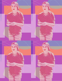
For this project I didn't really have a style or artist I was trying to copy. For the most part I was playing around with different tools and asking neighbors what they were doing or how I could make mine better and used some of those ideas. I used different shapes and colors in the background to give contrast. I added a filter to my subject as well as color and adding other aspects. After I was happy with my image my teacher gave me the idea of duplicating my image like done in lots of pop art. As well as duplicating the image I also decided to make my subject bigger and fill up more of the frame.
For the colors I really enjoy light colors such as light pink, blue, and purple so I decided to use those in my picture. Other then that I didn't have a set theme in my project. With making the shapes I used different shape tools that photoshop provides and I added different colors at different opacities. I tried to overlap a few shapes to make the picture look a little more 3D. I also used the stamp tool to add some random lines and other color as well as more contrast from different shapes likes and textures.
For the colors I really enjoy light colors such as light pink, blue, and purple so I decided to use those in my picture. Other then that I didn't have a set theme in my project. With making the shapes I used different shape tools that photoshop provides and I added different colors at different opacities. I tried to overlap a few shapes to make the picture look a little more 3D. I also used the stamp tool to add some random lines and other color as well as more contrast from different shapes likes and textures.


Comments
Post a Comment