typography
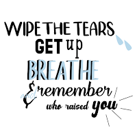
For this project I knew what quotes I wanted to use with out thinking about it too much. the quotes I used are ones I tell myself everyday and ones I live by. To start I went on da font.com and I downloaded at least 15 fonts just to have handy and so I could try a whole bunch of different styles without having to guess what the word will look like with the font.
After I put my quotes in styles and fonts I liked I added some pictures to go along with them. during this process I got done rather fast so I decided to add other quotes just so I had more to choose from. I had at least 8 black and white put together quotes and after playing around with them I choose my best 4.
As I started to add color I changed a lot about some of my quotes. Theres some I changed completely and like a lot more then the original version. I also added some more effects to the quotes as I added color. As I added more color I also added more graphics and designs as well as moved some things around. I also ended up changing some fonts and rearranging most my designs.
One of my black and white quotes I didn't really like but wasn't to sure how to make it look good. I started just adding colors and shapes to it. I decided to just restart the whole thing. I looked online for different layouts and fonts and found a layout I enjoyed and stated messing around with colors for it.
I enjoyed using black and white to make my quotes first so I had an idea of what I wanted to do when I added color and it cut out the stress of what colors look good together at the end. it kept me more organized and less stressed because I didn't have to worry about color. It made it easier to add color later and it also helped me find flaws in the work that I could fix.
Adding color after also made it easier to find a color pattern because there was less to worry about all I had to think about was color. This was my best work I've made all year and I'm proud of my finished product. I really enjoyed making this project and playing around with the letters and colors and see what I liked and disliked with my designs.
As you can see my finished product looks totally different from my black and white ones and I really like how they turned out and hope we do another project like this soon. I learned a lot about typography and I would enjoy to learn more and see what else I can create.


Comments
Post a Comment